Army-Navy Rivalry Sparked as New Uniforms Unveiled
As the rivalry between Army and Navy begins to heat up before their upcoming matchup this Saturday afternoon, the uniforms both squads will be wearing have been recently unveiled and are, as usual, committed to top-level and aesthetic design. Ohio native Camden O'Gara is donning the Army football jersey again this year, ready to give Navy a hard time on the turf.
For Navy, a simple dark blue tone topped with multiple features that highlight American symbolism is now part of this year's wear. According to the official Navy website description, the design was thought to stand as a tribute to one of the most classic fighter jets in American history, the F/A-18E/F Super Hornet, to highlight how the aircraft's engineering base is still evident in today's designs.
On the other hand, Army has opted to honor the Special Forces Operational Detachment Alphas and commemorate the strategic team's response in Afghanistan after the 9/11 attacks.
To honor ODAs, the uniforms have been designed in an opaque pearl, cream-shaded tone, and distinctive camouflage pieces with particularly elegant combinations of beiges and light browns.
Jerseys That Have Stood Out in Recent Years
Over the past several years, Navy has featured more bold and edgy designs, stepping away from the conventional. In 2020, the uniform was highlighted by a mix of bright blue over white-covered upper and lower pieces.
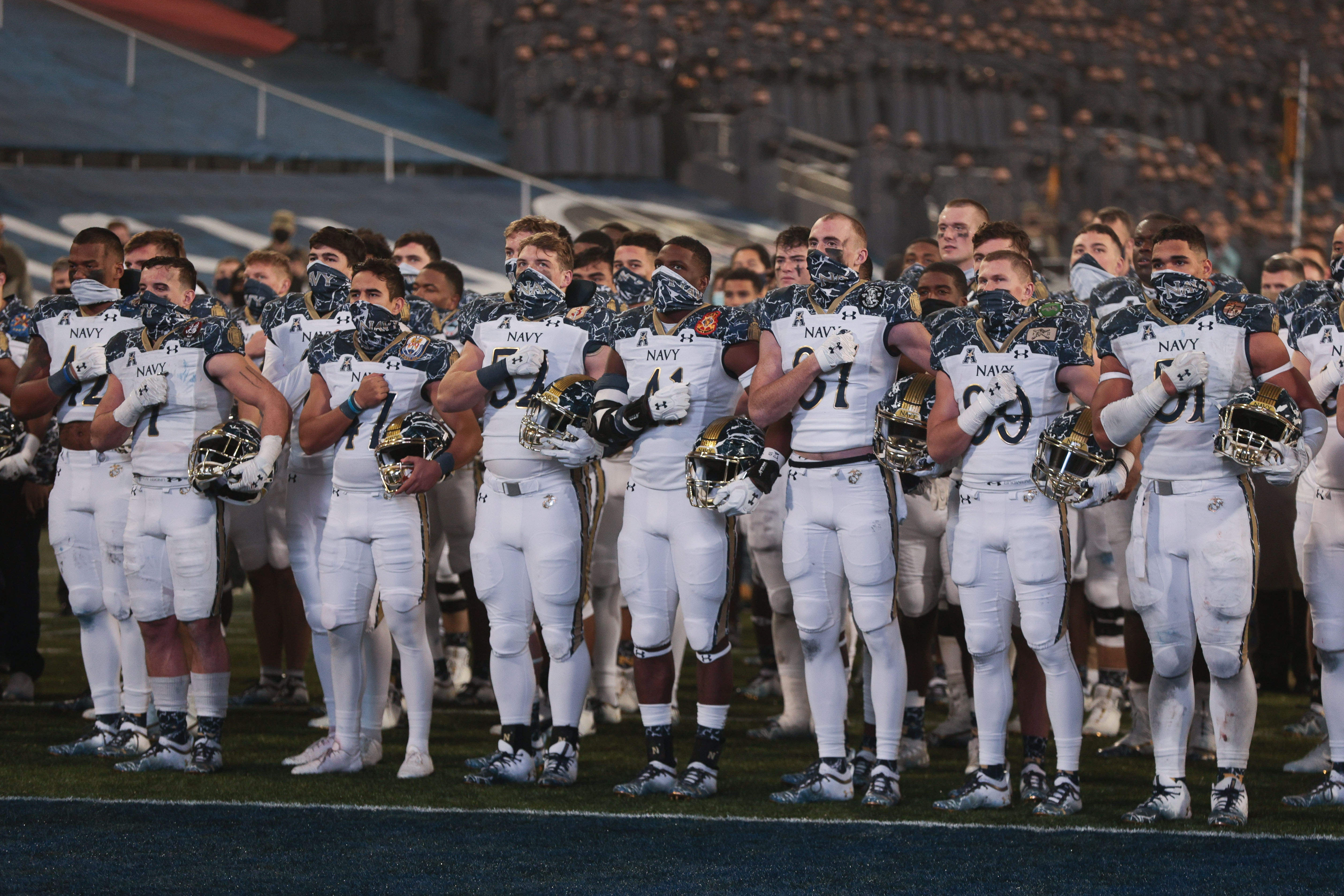
However, this year's uniform recalls some design basics from back in 2017, when a light blue shade overtook the entire piece with simple gold numbering and letters.
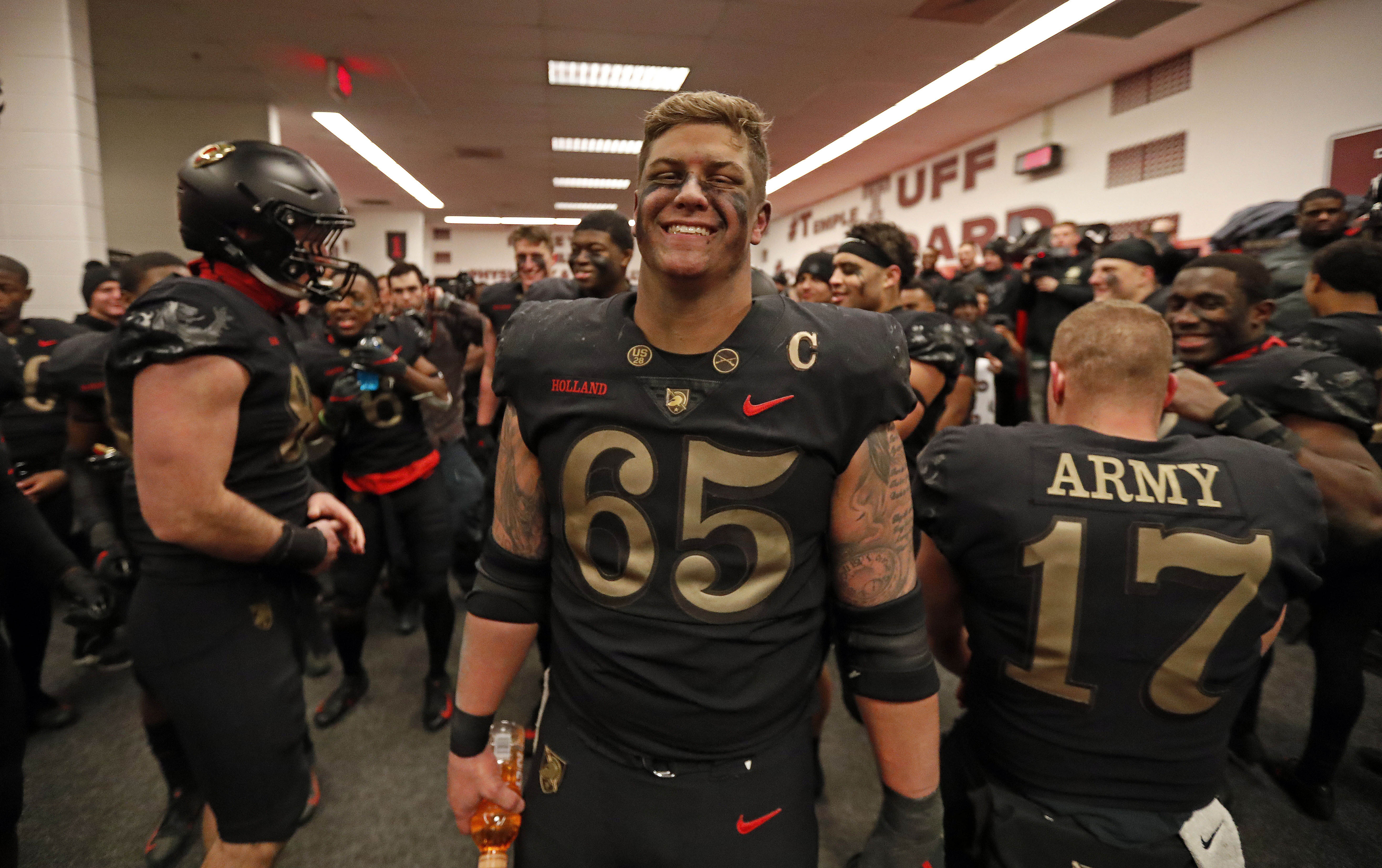
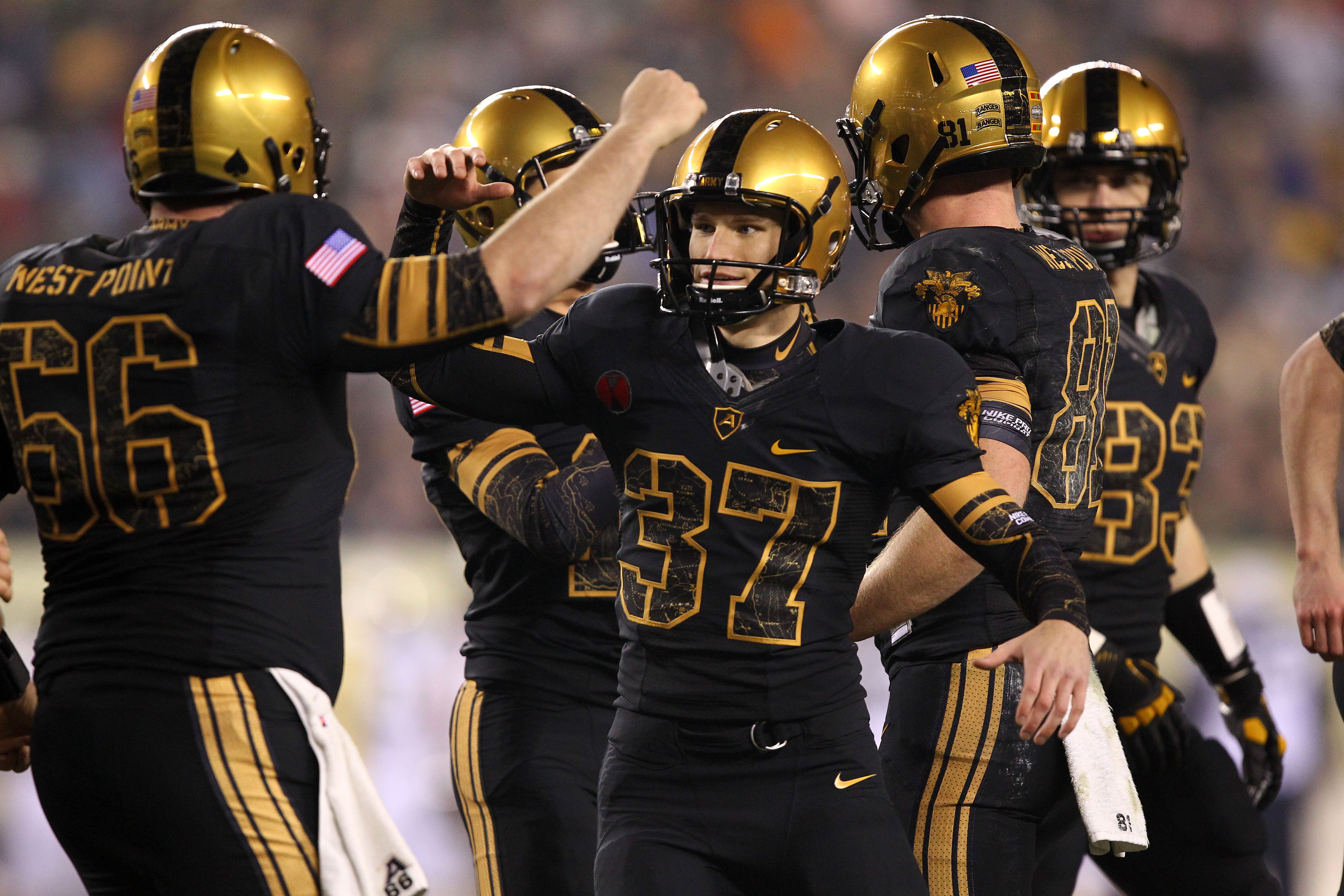
As for Army, bringing back classic tones sets the uniform apart from prior designs. Back in 2018, West Point unveiled full black-on-black wear with slight red details that were toned down to highlight the simplicity from prior years.
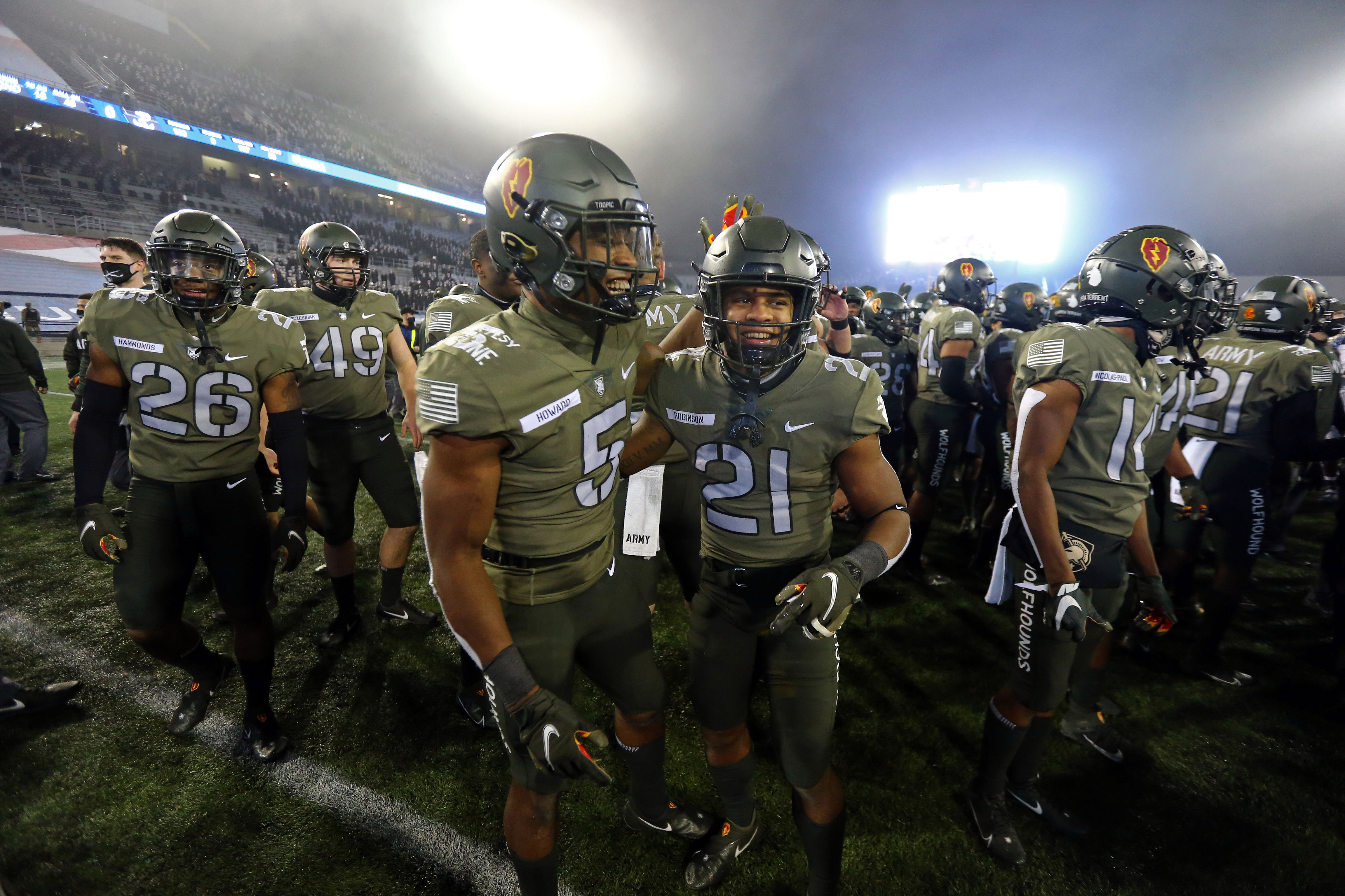
Some more edgy green tones intertwined with black and gold designs stole some looks back in the 2013 edition and in 2020 when the team was featured in a matte-green jersey with a dark gray helmet and pants.
It was in 2018 when both teams featured some of the best-looking uniforms of the last decade. Army covered themselves in bold black while Navy featured an all-white piece with simple navy blue and gold designs. That year, Army took a tight 17-10 over the Navy squad.

And if it's all about classic and elegant looks, 2012 featured a similar version of the 2018 uniform for Navy: simple gold and navy-blue highlights over a crisp white background.
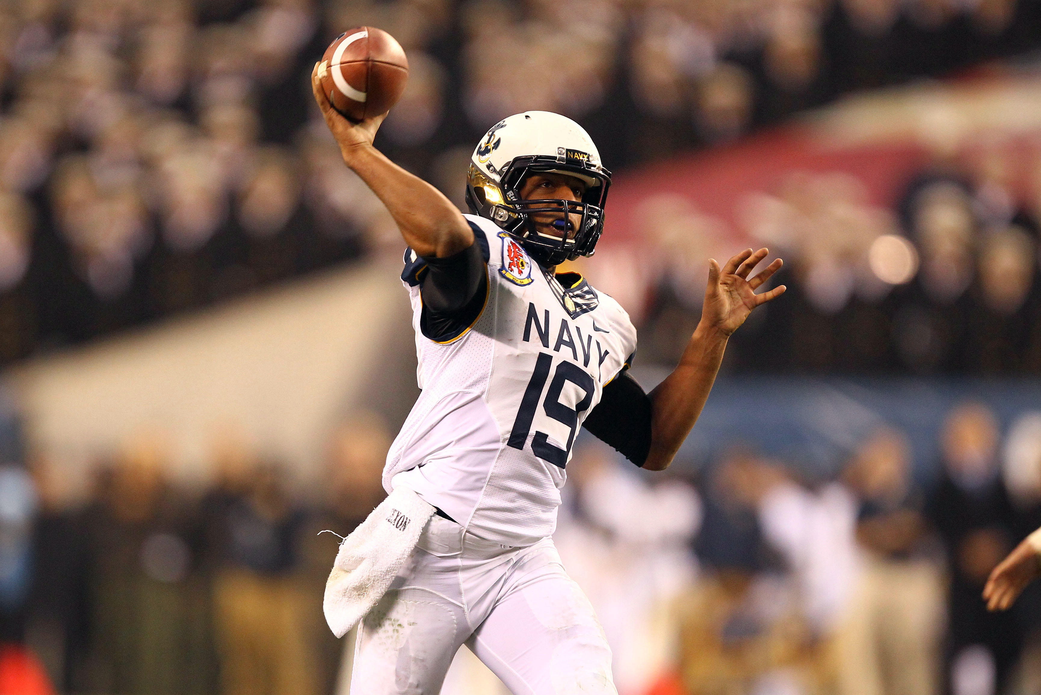
For Army, once again, it was a black and gold combination that inadvertently reminded folks of a classic New Orleans Saints look, yet with a much broader focus on black as the base. That year it was Navy who stole the show with a 17-13 win over Army.
Navy Blue Continues to Set the Pace for Best Jersey Design
Not much needs to be added to a navy-blue base for it to look simple and elegant. Sometimes, though, it's the edge taken to create a unique piece that helps that version stand as one of the sharpest looks in Army versus Navy showdowns.
It was in 2017 when Navy featured a simple, opaque blue jersey that stood out between golden helmets and pants. This version, by far, has managed to become one of the most unique sets in Navy's repertoire.
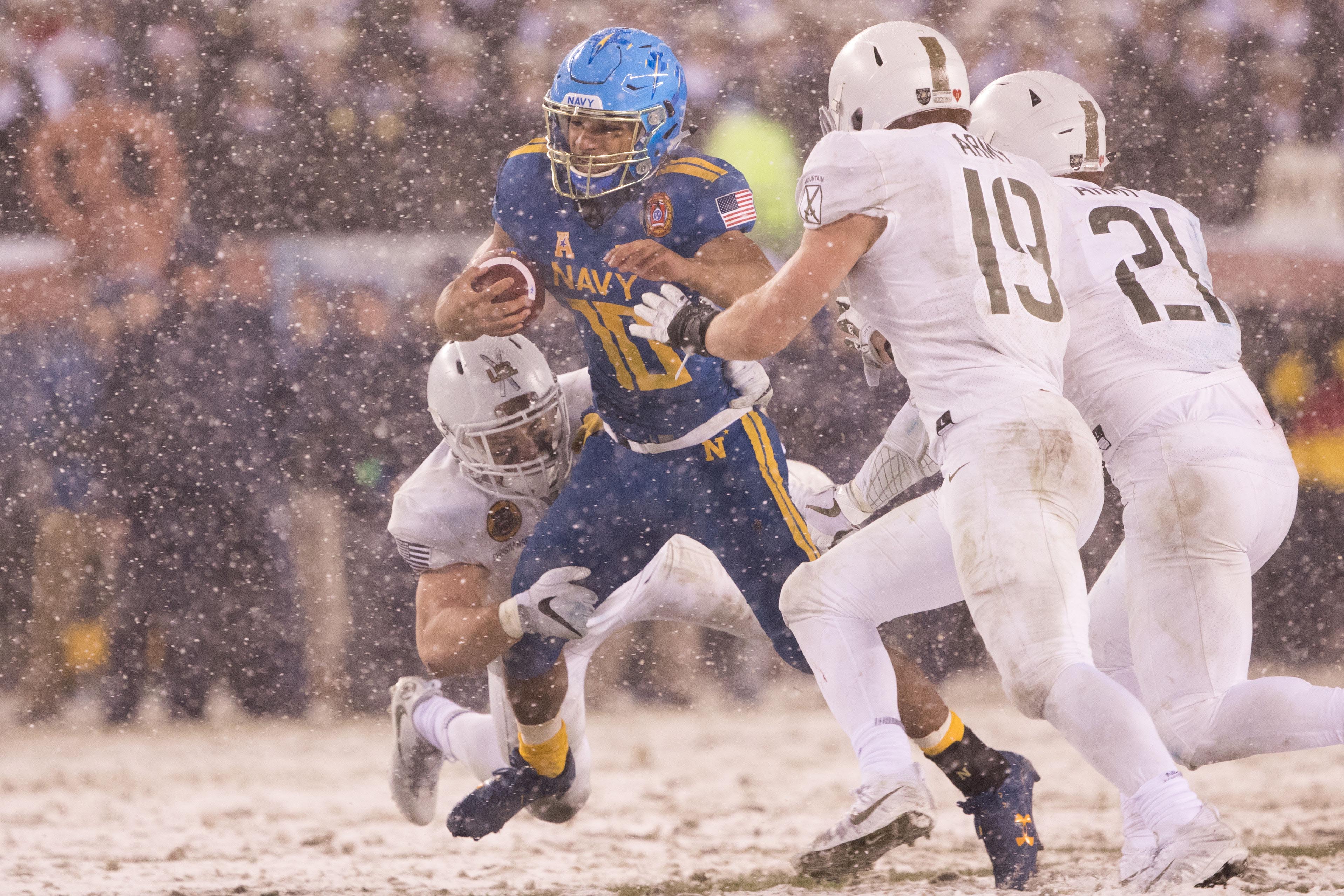
That year, even though they managed to out-shadow Army's attempt to feature a white and gold combination, they were still unable to prevent taking a tight 14-13 loss in that game.
Share article on: